by Deanna Rivera | May 5, 2025 | Branding, Content Creation, Graphic Design, Website Design
Twin Rivers Plumbing, Inc.
Twin Rivers Plumbing — a company known for excellence in plumbing services across residential, commercial, and industrial sectors.
When Twin Rivers approached us, the goal was clear: create a professional online presence that reflects the breadth of their services and the depth of their experience. The result is a clean, modern website that does just that — while making it easy for clients to explore the full range of what Twin Rivers Plumbing can do.
Web Design and Development:
- A visually engaging homepage that quickly communicates the company’s strengths and values.
- A robust portfolio section to highlight completed projects across multiple sectors, with high-impact images and key project details.
- Easy navigation to explore residential, commercial, and industrial services.
- A fully responsive design that looks great on any device — from mobile to desktop.
- Optimized calls-to-action that drive inquiries and service requests.
This site isn’t just about aesthetics — it’s built for performance and growth, giving Twin Rivers Plumbing the digital presence they deserve.
Forum Group: Two Brands, One Vision
We’re proud to showcase our work with both Forum Group PNW and Forum Group HR Recruitment Partners, two distinct but aligned staffing and HR firms under the Forum Group umbrella.
It began with Forum Group PNW, a trusted recruitment partner serving Oregon, Washington, and Idaho. They came to us for a professional, modern website that would reflect their people-first approach and proven success in direct hire, executive search, and long-term placements. We delivered a clean, mobile-friendly site with compelling content, streamlined navigation, and thoughtful calls to action — all designed to connect talent with opportunity.
Impressed by the quality of our collaboration, the corporate office in New York and New Jersey engaged us next to develop a website for Forum Group HR Recruitment Partners, their East Coast HR division. This new platform communicates the team’s strategic, relationship-driven approach to HR, from compliance to employee relations and beyond. The result is a clear, approachable site that reflects their values and supports their mission of building strong, people-centered workplaces.
We also created new logos for both branches of the company, ensuring a cohesive, professional brand presence across all touchpoints.
Together, these projects highlight Forum Group’s commitment to excellence — and we’re honored to have helped bring their vision to life.
Enjoyed these two websites? Want to see how we can provide custom web design and development for your business?
by Deanna Rivera | Mar 31, 2025 | Content Creation, Graphic Design, Website Design
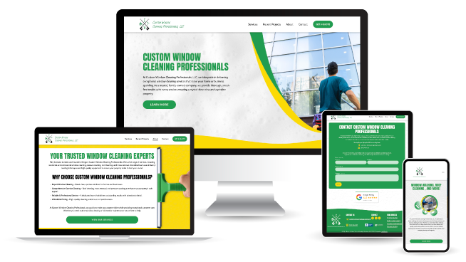
We don’t just build websites—we craft online experiences that reflect the excellence of the businesses we work with. When Custom Window Cleaning Professionals approached us for a website refresh, we saw an opportunity for a great small business website design. We took their existing site and turned it into a powerful tool for growth, visibility, and customer engagement.
Just like a streak-free window transforms the way you see the world, a well-designed website enhances how customers perceive a business. Custom Window Cleaning Professionals already had a strong reputation for their high-quality residential and commercial window cleaning services, but their website needed a refresh to better reflect their expertise and make it easier for customers to connect with them.
The Website Transformation
Polished & Modernized Design
A great website should be as clean and seamless as the service it represents. We updated the layout, improved navigation, and ensured a mobile-friendly experience—because most customers are searching for home services from their phones. Now, the site feels sleek, professional, and easy to use.
SEO That Makes a Difference
A beautifully designed website is only effective if people can find it. We took a deep dive into keyword research, optimized site content, and refined meta descriptions, headers, and alt text to improve search engine rankings. With these enhancements, Custom Window Cleaning Professionals can now reach more potential customers searching for window cleaning in their area.
Clear, Engaging Content
We refreshed the website’s content to be more compelling, concise, and conversion-focused. The new messaging speaks directly to homeowners and businesses, highlighting the value of professional window cleaning, the benefits of working with Custom Window Cleaning Professionals, and the ease of scheduling a service.
Faster, Smoother Performance
A slow website can be as frustrating as a streaky window. We optimized page speed, image compression, and site functionality to ensure a smooth, fast experience—keeping visitors engaged and increasing conversions.
A More Effective Call-to-Action
The old site made it difficult for customers to take the next step. We implemented clear, easy-to-find "Get a Quote" and "Schedule Now" buttons, making it seamless for visitors to request services with just a click.
The Results?
A Small Business Website Design That Works as Hard as They Do
With these enhancements, Custom Window Cleaning Professionals now has a website that truly reflects their professionalism, quality service, and commitment to customer satisfaction. Their SEO-optimized pages are positioned for better visibility, and the refreshed content and design ensure a great user experience.
At UplinkSpyder, we love taking existing websites and giving them new life—because your online presence should be as polished as your business itself.
Want to see how we can do the same for your business?
by Deanna Rivera | Mar 19, 2025 | Branding, Graphic Design, Website Design
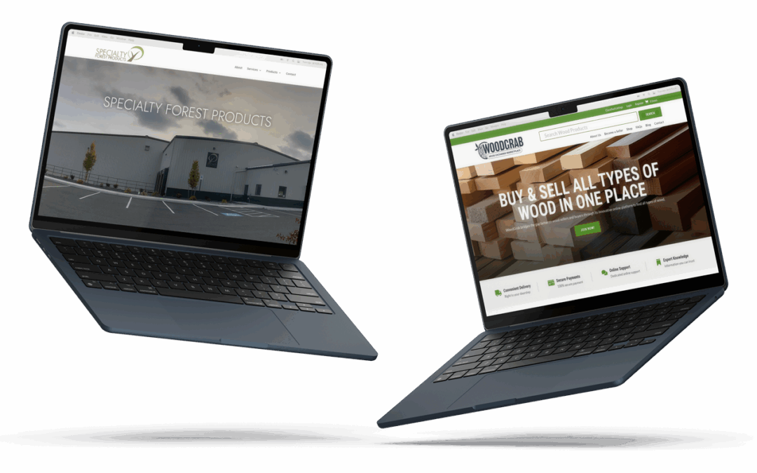
We’re excited to announce the launch of two new websites we’ve had the pleasure of building: WoodGrab and Specialty Forest Products. These projects are part of our growing portfolio in the timber and specialty wood industries, and they reflect our commitment to helping businesses connect more effectively through thoughtful design and functionality. Both sites serve a valuable role in the industry—each acting as a digital marketplace that makes it easier for professionals to find what they need, offer what they have, and build lasting partnerships.
WoodGrab is a straightforward, user-friendly digital marketplace built specifically for the wood industry. Whether you're a small mill looking to move excess inventory or a contractor searching for specific lumber grades, WoodGrab simplifies the buying and selling process. The platform is designed to reduce friction—eliminating traditional barriers and making it easier for both buyers and sellers to find each other quickly and efficiently. Because buying and selling wood shouldn’t be a logjam.
Specialty Forest Products
Specialty Forest Products is your trusted source for high-quality wood materials, including custom cuts, rare grades, and specialty products for fine woodworking, construction, and design. Their new site reflects their decades of experience and commitment to craftsmanship. With clean navigation and detailed product information, it gives customers the confidence to choose the right materials for the job—and highlights the expertise that sets them apart in a competitive market.
Both sites are live and already helping businesses and builders across the region get what they need, faster. We encourage you to explore them, see how they work, and let us know what you think. Your feedback means a lot and helps us continue building better online tools for great companies.
by Deanna Rivera | Mar 12, 2025 | Branding, Content Creation, Graphic Design, Website Design
It's been a busy month at UplinkSpyder. We’re pleased to announce the launch of two new business websites: Chris Watkins Mortgage and The Forum Group PNW. These projects reinforce UplinkSpyder’s commitment to creating functional, well-designed business websites that support our clients’ goals and provide a great user experience.
Chris Watkins Mortgage helps homebuyers navigate the loan process with clarity and confidence. With a focus on transparency and personalized service, Chris provides valuable resources to make home financing more accessible.
The new website is designed to be straightforward and informative, offering an easy-to-navigate layout, educational content, and clear next steps for potential clients.
The Forum Group PNW, led by Jennie Joiner, specializes in direct hire and executive staffing across Oregon, Washington, Idaho, and California. With a focus on building strong professional connections, they help businesses find top talent while supporting job seekers in their career growth.
Their new website clearly communicates their expertise and services, making it easy for job seekers and employers to find the information they need. The site is designed for clarity and usability, ensuring a seamless experience for all visitors.
These launches mark another step forward for our clients, and we’re proud to support their success with websites that align with their needs and industry standards.
by Deanna Rivera | Jan 21, 2021 | Branding, Graphic Design
What is the current state of your branding package? Is your logo responsive? Just like a website, a logo will benefit your business the most if it responds to mobile devices. If a website isn’t optimized for mobile viewing 91% of customers will turn to a competitor.
In a world where screens come in all manner of shapes and sizes your logo will benefit your bottom line the most if it is recognizable and memorable everywhere. However, this means much more than making your logo larger or smaller to fit the screen. Your logo will best serve your business if it is responsive and adapts to any use-case accordingly.
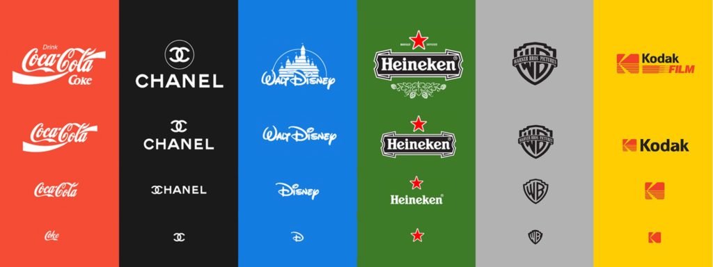
Image Source: https://medium.com/@jackanto/responsive-logo-must-to-follow-4901cb0cfcbc
Creating Trust
A branding package is much more than just a set of pretty graphics made for your business. Logo packages should be designed to serve a purpose. A brand that functions well is like a digital storefront: When your brand is attractive, updated, and appealing it will help create a foundation of trust between you and your customer.
Even as late as 2015 most small businesses could get away with one version of their logo in one place: on the sign in front of their business. Today’s logos have to function better and accomplish much, much more than they used to. Over 50% of consumers surf the net on smartphones. If your logo can’t scale down to smaller screens you’re potentially turning away over half of your business.
Over 80% of customers view your digital storefront before they visit your actual business or make a purchase decision. For a website to scale effectively you need a logo that scales as well. Customers are more likely to trust you if your business is well-represented in all scenarios.
Responsive Logo Attributes
Every logo that has been designed to be responsive shares a few specific traits. Those traits, in order of importance are:
- A responsive logo is recognizable in black and white, even if the mark has color it must be recognizable and clean without it. Why? If your logo doesn’t work in black and white it won’t work well on different mediums such as laser engraving, wood and glass etching, and vinyl cuts.
- It must be recognizable at sizes as small as 32 pixels wide. Why? Because your logo needs to be recognizable from a distance as well as on small devices.
- There must be different versions for different media types in addition to versions that work well on any background. Why? Because your logo should be easy to use, it should look great on a photo, solid color, or on black or white.
- There must be an icon and a wordmark that can stand separate from each other and still be recognizable. Why? There are times where it isn’t appropriate to put your entire logo on a document or product. This is why it is best to have both text and an icon that can stand apart and still represent your business.
- There are versions that scale to large sizes effectively and add meaning as a logo gets larger. Why? Small marks, when scaled up, can often dominate space and be the center of visual attention in a bad way. They’re optimized for contrast at small sizes, but that contrast can be too much at large sizes. A great example of this is the Warner Brothers logo above.
Improve Your Customer Relationship with a Responsive Branding Package
A responsive logo and branding package can work wonders to improve the relationship you have with your customers and even increase the value of your product. Contact UplinkSpyder and we’ll make sure to set you on the right path with a logo for your business that communicates, is responsive, and is beautiful.
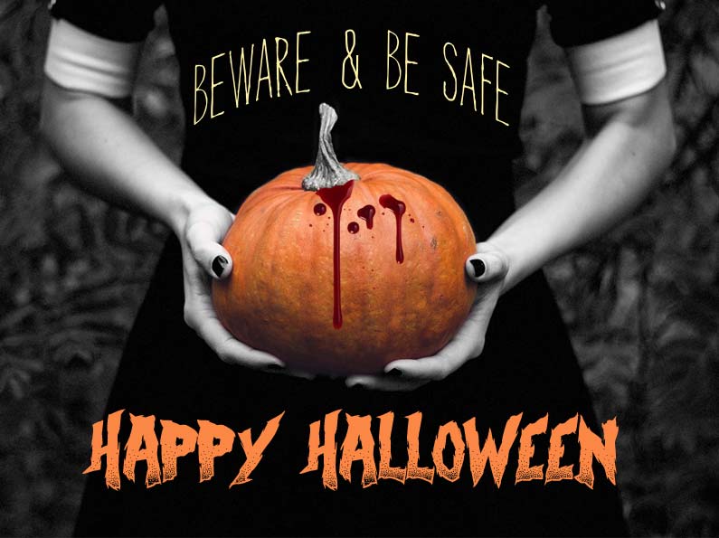
by Administrator | Oct 31, 2016 | Graphic Design
All of us at UplinkSpyder are wishing you a fun and safe Halloween! We are celebrating it in the best way we know how: FREE Halloween graphics! Wish your friends, family, and customers a Happy Halloween by posting one (or all!) of these graphics to your Facebook wall, and/or other social media!
You can also share them directly from our UplinkSpyder Facebook page.
Have a wonderful, spooky Halloween!
Pick your favorite of our Halloween graphics below: