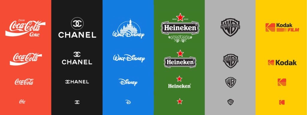
What is the current state of your branding package? Is your logo responsive? Just like a website, a logo will benefit your business the most if it responds to mobile devices. If a website isn’t optimized for mobile viewing 91% of customers will turn to a competitor.
In a world where screens come in all manner of shapes and sizes your logo will benefit your bottom line the most if it is recognizable and memorable everywhere. However, this means much more than making your logo larger or smaller to fit the screen. Your logo will best serve your business if it is responsive and adapts to any use-case accordingly.
Image Source: https://medium.com/@jackanto/responsive-logo-must-to-follow-4901cb0cfcbc
Creating Trust
A branding package is much more than just a set of pretty graphics made for your business. Logo packages should be designed to serve a purpose. A brand that functions well is like a digital storefront: When your brand is attractive, updated, and appealing it will help create a foundation of trust between you and your customer.
Even as late as 2015 most small businesses could get away with one version of their logo in one place: on the sign in front of their business. Today’s logos have to function better and accomplish much, much more than they used to. Over 50% of consumers surf the net on smartphones. If your logo can’t scale down to smaller screens you’re potentially turning away over half of your business.
Over 80% of customers view your digital storefront before they visit your actual business or make a purchase decision. For a website to scale effectively you need a logo that scales as well. Customers are more likely to trust you if your business is well-represented in all scenarios.
Responsive Logo Attributes
Every logo that has been designed to be responsive shares a few specific traits. Those traits, in order of importance are:
- A responsive logo is recognizable in black and white, even if the mark has color it must be recognizable and clean without it. Why? If your logo doesn’t work in black and white it won’t work well on different mediums such as laser engraving, wood and glass etching, and vinyl cuts.
- It must be recognizable at sizes as small as 32 pixels wide. Why? Because your logo needs to be recognizable from a distance as well as on small devices.
- There must be different versions for different media types in addition to versions that work well on any background. Why? Because your logo should be easy to use, it should look great on a photo, solid color, or on black or white.
- There must be an icon and a wordmark that can stand separate from each other and still be recognizable. Why? There are times where it isn’t appropriate to put your entire logo on a document or product. This is why it is best to have both text and an icon that can stand apart and still represent your business.
- There are versions that scale to large sizes effectively and add meaning as a logo gets larger. Why? Small marks, when scaled up, can often dominate space and be the center of visual attention in a bad way. They’re optimized for contrast at small sizes, but that contrast can be too much at large sizes. A great example of this is the Warner Brothers logo above.
Improve Your Customer Relationship with a Responsive Branding Package
A responsive logo and branding package can work wonders to improve the relationship you have with your customers and even increase the value of your product. Contact UplinkSpyder and we’ll make sure to set you on the right path with a logo for your business that communicates, is responsive, and is beautiful.
