541-654-8125
Website Design Ideas, Trends, and Important Features

Website Design Ideas, Trends, and Important Features

Pretty much every business on the planet needs to have some sort of presence online. 85 percent of consumers conduct online research before making a purchase. Here are some great website design ideas and trends to keep an eye on so you can ensure that your website looks and functions great no matter where someone views them or what device they’re using.

Website Design Ideas

Website design trends vary year-to-year as people grow more used to new innovations in digital design, but there are some foundational elements of any good website that remain consistent. For instance, white space is a big deal on websites—and it’s important not just because it looks nice; more blank space means more room for your content to breathe. 

Another trending idea right now is flat design, which means websites have fewer (or no) gradients or shadows and generally use flat colors. It may sound boring, but flat design has been adopted by most major tech companies as well as smaller startups trying to get noticed.

Website Trend #1 – Live Videos

If you’re looking for an engaging way to showcase your products or services—and a way to differentiate yourself from competitors—consider adding live videos to your website. Streams like Periscope allow users to broadcast videos directly through their social media platforms, making it an ideal solution for reaching large audiences. And if you don’t want all of your videos streamed live, you can always pre-record them and post them on YouTube.

Website Trend #2 – Pop-Ups

Pop-ups should be used if they serve a specific purpose other than just monetization, which is always (ALWAYS) a secondary priority. Try not to make users go through more than they need to in order to consume your content. Remember: It’s not about you; it’s about them. If you do decide to use pop-ups, don’t make them too big or intrusive. And remember that there are many ways to monetize without having ads covering every inch of your website. 

Website Trend #3 – Original Photography

When someone visits your website, they should immediately feel like they know who you are. They should feel like they know what kind of company you run, what you sell, and why they should buy from you specifically. Original photography or imagery is an excellent way to convey personality through imagery while also giving people something interesting to look at while they read through your story. 

Website Feature #1 – Easy Navigation

Your website’s navigation should be intuitive. You don’t want to confuse your users by making them jump through hoops just to get where they need to go. Try to find a balance between simple and interesting. The best way to determine whether or not your website is navigable is to test it with people who aren’t familiar with how websites work. Let them navigate around on their own without any help from you and see if they have any problems getting around.

Website Feature #2 – Form Validation and Auto-Email

As soon as a visitor fills out a form on your website, they expect it to accept or deny their entry. This is vital because visitors will move on to another website if they believe your form isn’t working correctly. Make sure you include validation on every form that accepts input from visitors. 

It’s also a good idea to ensure that an automatic email goes to the customer in case they miss the validation. That email can offer an alternative way to contact you, an incentive, a tip. It’s an opportunity to reinforce your brand and encourage loyalty.

Website Feature #3 – Responsive Screen Size

Many websites today are still not responsive to multiple screen sizes and this is so important! A website should change to fit the device it is being viewed on. When we build a website, we view it on multiple devices to ensure that every user can navigate the site easily and receives the same, impactful presentation. 

You’re On Your Way To A Great Website Design

There’s a lot more to consider, but luckily, we can do the considering for you! If you want more website design ideas, or an expert to help build you a fantastic website, give us a call.
The Launch Of Lane Leaders New Website

The Launch Of Lane Leaders New Website

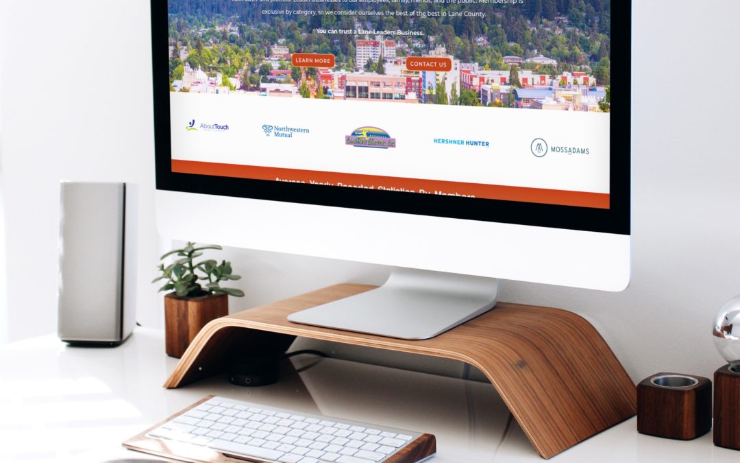
Last week, we launched a new website for Lane Leaders! Lane Leaders is an exclusive “one business per category” referral and networking group that we were honored to become a part of a little more than a year ago.

In just a few months, Deanna earned an award for being “Rookie of the Year” and throughout the pandemic, she has been moderating the ZOOM meeting sessions once a week (at 7am), working hard to help ensure that everyone stays connected.

The new website became a labor of love for our entire team and we’re very proud of it. It will promote and support the myriad of small businesses that are fellow members, and who we have become very fond of throughout the past year. We are now moving on to phase 2 of this project, which is for members only.

The new site features an awesome Business Directory. If you are searching for a service, restaurant, consultant, and more — start with Lane Leaders. Every business is vetted and highly recommended! See it here.

January Launches!

January Launches!

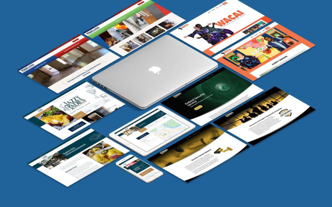
In January, our team launched four new websites and two new logos that I’d love to share with you today. The best thing about doing this work is that our team can see the impact that our work makes on the businesses that trust us with this honor. Some of our goals for this include:
  • Search — attracting a larger quantity of qualified traffic.
  • Image — improving user trust and impression through impeccable design and strong content.
  • Usability — ensuring each potential user can find what they are looking for quickly and easily.
During this time, it’s more important than ever to have an amazing online presence. We hope you’ll agree that each of these businesses have met that challenge with our help. We look forward to showing you many more beautiful new websites in the weeks and months to come.

With gratitude, Deanna Rivera, CEO
 

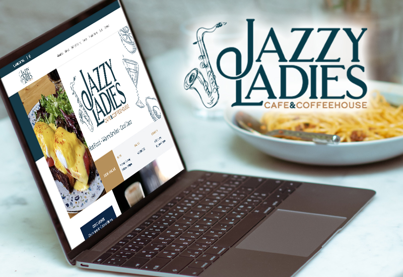
Jazzy Ladies

Eugene, OR

A local cafe and coffee house specializing in gluten-free options. We also created their new logo.


Federal Security

Eugene, OR
Lane County’s #1 security service provider for over 25 yearsWe also created their new logo.

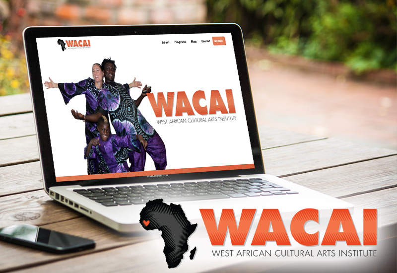
WACAI 

Eugene, OR
A non-profit cultural art institute that shares Guinean culture.


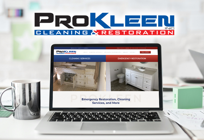
ProKleen

Eagle Point, OR
Cleaning company specializing in emergency services and premier cleaning.

2020 Websites of the Year

2020 Websites of the Year

There are countless stories to tell. We feel honored and blessed to help other small business owners during these times and we are so excited for the years ahead. In the above video, we highlight 5 of these stories. 

jazzyladiescafe.com   •   bethesdalutheranchurch.com       coburgfit.com   

riverhouseflorence.com   •   old-town-inn.com   •    bubzgrubhub.com

Our Spyders have been working hard lately, but that hard work has paid off in the form of several beautiful new websites! Check out our latest website launches below. 

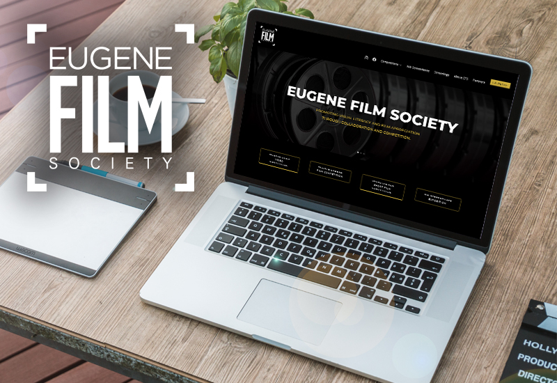
Eugene Film Society

Eugene, OR

Community arts organization that
supports regional filmmaking.

eugenefilmsociety.org

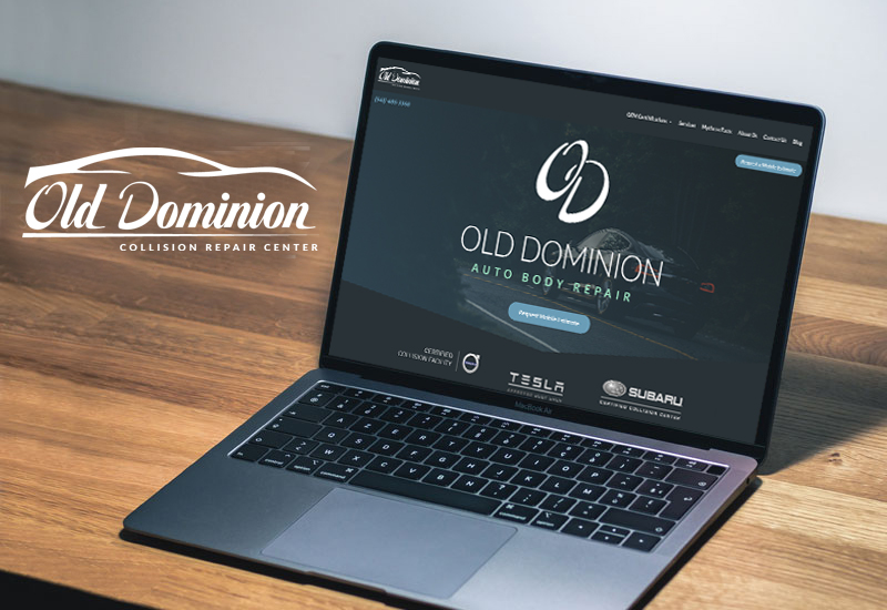
Old Dominion

Eugene, OR

Impeccable auto repair services with excellent customer service.

olddominioncollision.com

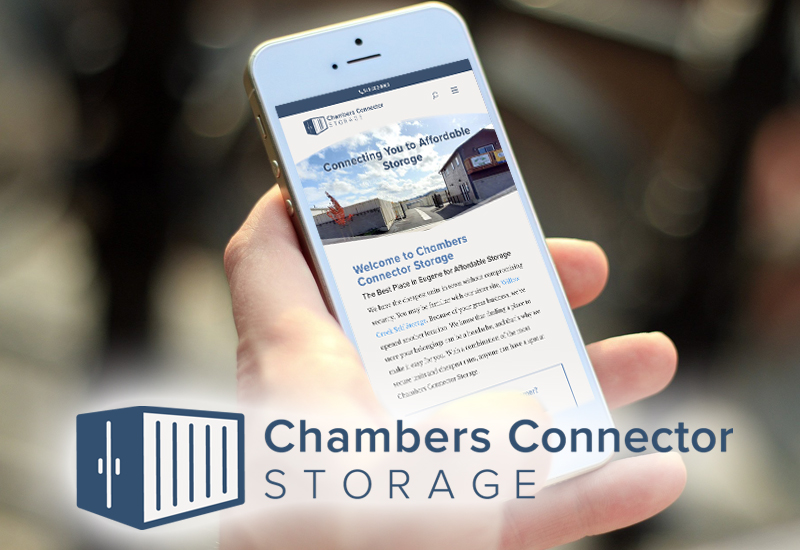
Chamber Connector Storage

Eugene, OR

Connecting you to affordable storage.

chambersconnectorstorage.com


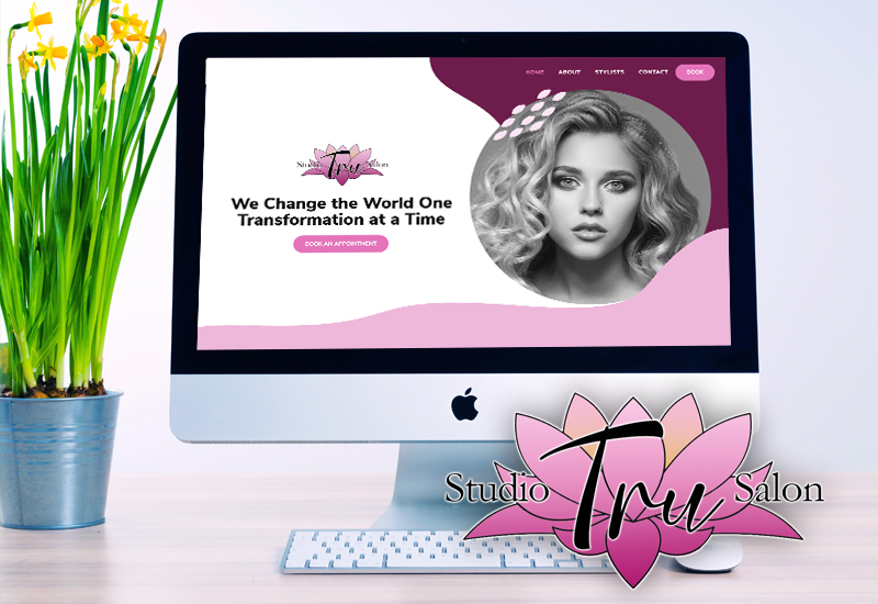
Studio Tru Salon

Eugene, OR

We go above and beyond to make you feel like a king or queen while visiting our professional hair salon & studio.

studiotrusalon.com 

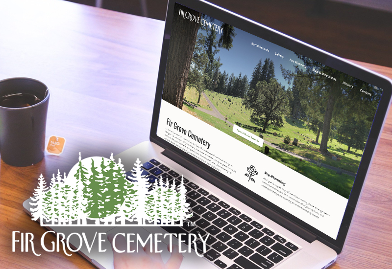
Fir Grove Cemetery

Eugene, OR

Fir Grove Cemetery is one of the most beautiful and peaceful memorial settings in Oregon.

firgrovecemetery.com

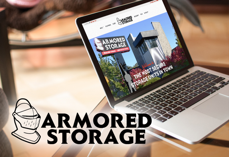
Armored Storage

Eugene, OR

We go above and beyond to make you feel like a king or queen while visiting our professional hair salon & studio.

armoredstorageeugene.com

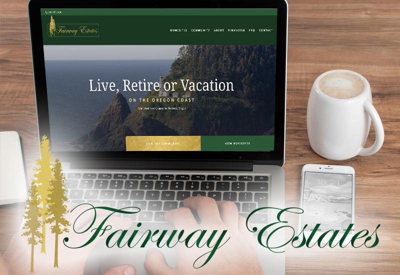
Fairway Estates

Florence, OR

Come live in Oregon’s
coastal playground.

fairway-estates.com

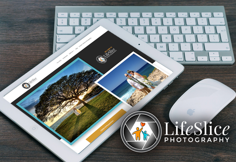
LifeSlice Photography

Eugene, OR

We bring the art of photography
to a new level.

weddingphotographyeugene.com

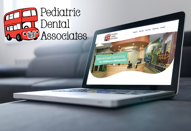
Pediatric Dental Associates

Eugene, OR

Specialized dentistry for children and adolescents in a warm and fun environment.

eugenepediatricdentist.com

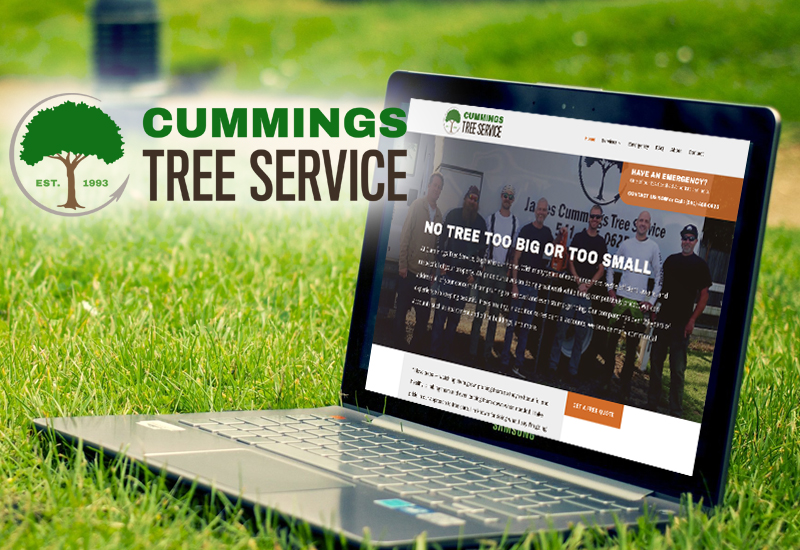
Cummings Tree Service

Eugene, OR

No tree is too big or too small.

jamescummingstrees.com

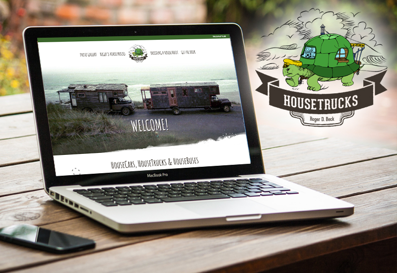
HouseTrucks

Eugene, OR

Some turtles have nice shells.

housetrucks.com

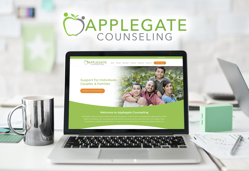
Applegate Counseling

Eugene, OR

Support for Individuals,
couples & families.

applegatecounseling.com 

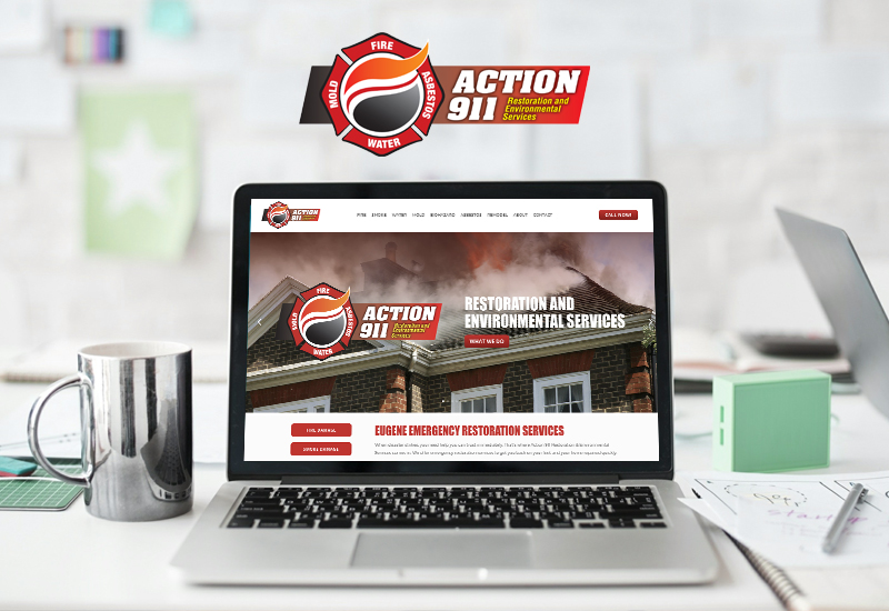
Action 911

Eugene, OR

Emergency restoration services for homes and businesses in Lane County.

4action911.com

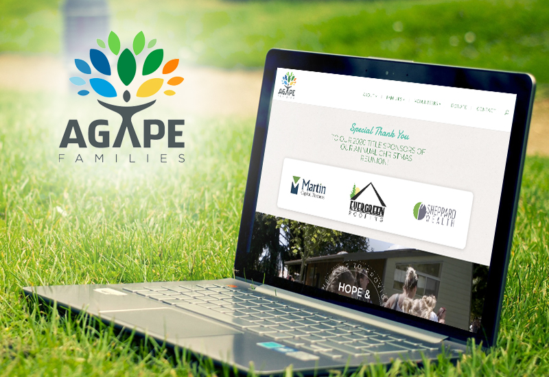
Agape Families

Eugene, OR

Oregon-based non-profit that aims to provide hope and stability to families impacted by incarceration.

agapefamiliesoregon.org

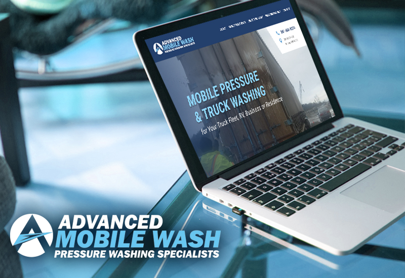
Advanced Mobile Wash 

Eugene, OR

Mobile pressure & truck washing for your truck fleet, RV, business
or residence.

amobilewash.com

How to Build a Website From Scratch – The Right Way – 3 Easy Steps

How to Build a Website From Scratch – The Right Way – 3 Easy Steps

We work with a lot of clients that start out building their own website on any number of “do it yourself” platforms like Weebly, Wix, GoDaddy, Square and more. And every once in a while, we support this and help improve these websites – usually because of budgetary concerns. Because of this, we feel it’s important to help others understand best practices for how to build a website from scratch on one of these DIY platforms. Our intention is to save you money, time, and frustration.

NOTE: We absolutely feel the best possible investment you can make in the growth of your business is a stand-alone website. You’re facing an uphill battle if you try to go it alone. There are many reasons for this, that we’ll include at the bottom of this article. But we do want to help if you choose the DIY model.

#1 Content – The One Word Answer to “How to Build a Website From Scratch?”

If you aren’t willing to write content when you build your website…at least 3000 words of it to start and more over time…then you’re wasting your time. Your website will not be found in organic keyword searches unless you point ads to it or have very little competition. Content is the #1 essential ingredient in being found. There’s an expert recipe for creating awesome searchable content. But you can get by just starting with 300 words about each of your services or products, 300 words about you and your team, 300 words about frequently asked questions, and 300 words about anything else important to your customers. Try to write 10 pages.

If you can afford it, hire an expert to look at the content through the lens of a search engine. Maybe even have this expert (hint: us) map out the keywords you should write around. If your eyes started crossing just now, then just write. The only point here is that there are ways to make the content better and give each page a better chance of being found.

Adding more content over time is the key to building your website to become a marketing tool for you. Stagnant websites don’t get as much love, period. Think of your website as a honeycomb. Every page adds a cell to the comb and every cell attracts more bees. Buzz. Buzz.

#2 SEO Tools

Every one of the DIY builders has optional tools for creating metadata. Use these tools to the best of your ability (or hire us to help). The most useful reason is because you can craft your SERP (Search Engine Results Pages). These are the little snippets that show up in searches. Like this one:

how to build a website from scratch

A SERP has a title, a URL and a description.

The DIY builders most often will let you craft these SERPS. Again, there is an expert recipe for this, but the best thing to do if you are going it alone is to try to attract a click. Use action words. Highlight the best of what they’ll learn if they click.

#3 Design

Almost every single DIY website we’ve seen has too many images that take up too much space, are too large, and don’t fit well with the text. Because you aren’t a graphic designer, the chances of you having the same issue are pretty good. So. Follow my father’s advice: KISS. Keep. It. Simple. Sweetie.

One photo per page. Try not to have it be a ginormous photo. Try really hard to make sure it isn’t pixelated. Try to have the content come FIRST, before the photo, so that the search engines will get to the content before running into an image.

Why Don’t We Want You to Follow Our Three Steps for How to Build a Website From Scratch?

I like the bee reference from before, so let’s continue with that. No matter what you do, using a DIY builder means that you will be part of a hive – a very, very, very, very big hive. And so when a search engine finds you, they’ve had to enter that hive and there are a lot of distractions. Even if you have your own URL pointing to your section of honey – there are still obstacles and it’s really noisy, so a search engine won’t stay too long. They prefer websites that have their own piece of property.

Also, you don’t own a DIY website but more, you’re renting it. You own the content, which is another reason to invest in that because you can take it with you when you’re ready.

Last, you won’t be able to easily change the way it looks once you’ve chosen a template so it’s harder for the website to grow with you. Whereas websites we create for you are modular and can morph and change and grow over time. Plus, there are tons of other options for search optimization, functionality, and beautiful design.

The biggest issue is always cost. Keep in mind that we offer payment plans and also think about the investment against a bigger picture. Your website is the single biggest and best marketing tool you can have for the ongoing growth of your business. Somewhere around 90% of people look at a business online before buying from them. That’s almost everyone. Mic drop. 🙂


6 Brand New Website Launches of 2019

6 Brand New Website Launches of 2019

We’re proud to announce that we have not one, not two, but six new website launches to share with you! From storage facilities to a family therapist a beauty guru, take a look at our newest additions to the UplinkSpyder web.

Family Roots Therapy

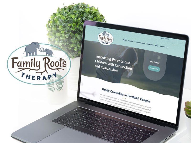
Family Roots Therapy, based in Portland, helps young children and families through trauma. The psychiatrists at Family Roots believe that too often, children’s issues are treated as an afterthought and because of that, they commit themselves to deliver timely help. Their website features an easy-to-navigate layout with friendly imagery. There’s also a simple portal where clients can make appointments, pay bills, or send a secure message to therapists.

Castle Storage

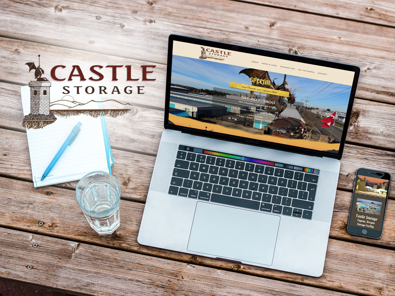
When you visit Castle Storage in Eugene, you’ll immediately notice a large dragon. Her name is Ophelia and she guards her treasure as well as yours.

The Castle Storage website was built with Ophelia in mind. The imagery was fun to work with on this one! Rich brick textures and gold highlight the site, while information and a payment portal for users are easily accessible.

Planet Storage

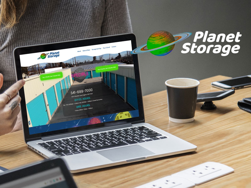
Planet Storage’s website is just plain fun. Buttons glow green and playful alien caricatures (hand illustrated by our designer, Alina) guide visitors through the website.
Based in Eugene, Planet Storage has out of this world staff who readily help answer any questions you may have.

Swiss Clinique

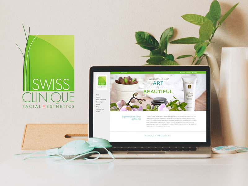
Swiss Clinique treats clients to the pampering of a lifetime. This new website (our second build for this Orange County day spa) features information on owner Evelyne’s luxurious services and hosts an upgraded e-commerce portal for sales of “Swiss Approved” skin care and makeup products, some of which Swiss Clinique is the sole US distributor for.

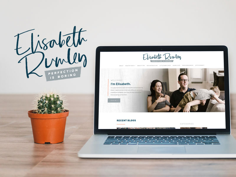
Elizabeth Rumley

A pharmacist turned lifestyle blogger and entrepreneur, Elizabeth Rumley’s website has a deliciously clean layout. If an ocean breeze scent could exist on a website, this is where you’d find it. Elizabeth writes about her two sons and husband, her life in San Antonio, Texas, and her love for Monat hair products.

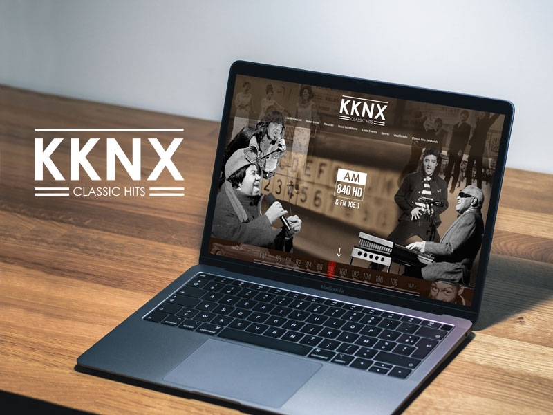
KKNX Radio 84

Who doesn’t love the classics? Hosted by “The Voice” John Mielke and the most knowledgeable DJs in radio, KKNX Classic Hits radio (105.1 FM) spins only the best tracks (plus news, weather, and sports!). Listeners don’t have to tune in to the radio though – they can listen anywhere, thanks to the website’s live streaming option.

If you’re in the market for a website, marketing help, or content creation, give UplinkSpyder a call. We specialize in creating personalized websites for your brand. If you work with Uplink, you can rest assured that no one knows the web like a Spyder.